

restarts
when the first drawing doesn’t go as planned

I’ve been quiet on Substack while I’ve been busy the last month prepping for an October monthly drawing challenge called ‘Peachtober’ run by artist Sha’an d’Anthes (@furrylittlepeach) over on IG. But I’m happy to be back!
When working on a final illustration, I’ll usually get it ‘right’ the first time round and be happy with it. What helps this is that my process now includes prep work (a rough sketch, a refined sketch, and a colour test). I didn’t always do so much prior but from working on commissions, I’ve gotten used to and come to appreciate ironing this stuff out early on.
As I’ve been trying to introduce more traditional media into my work, I’ve found I’m not always happy with the first piece. I know this is completely normal and actually a good thing a lot of the time, as it challenges me. But it can also be very frustrating, as I put so much into the first round that having to go through all that again can be tiresome and while working on the pieces for Peachtober, I’m short on time.
I wanted to share some trial and errors with you.
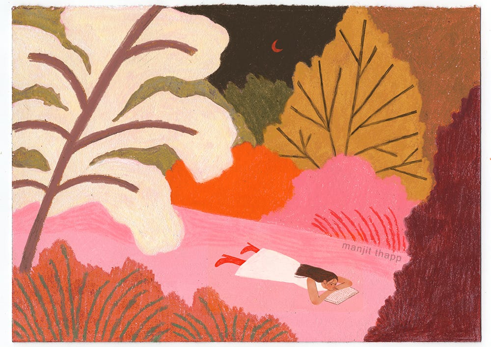
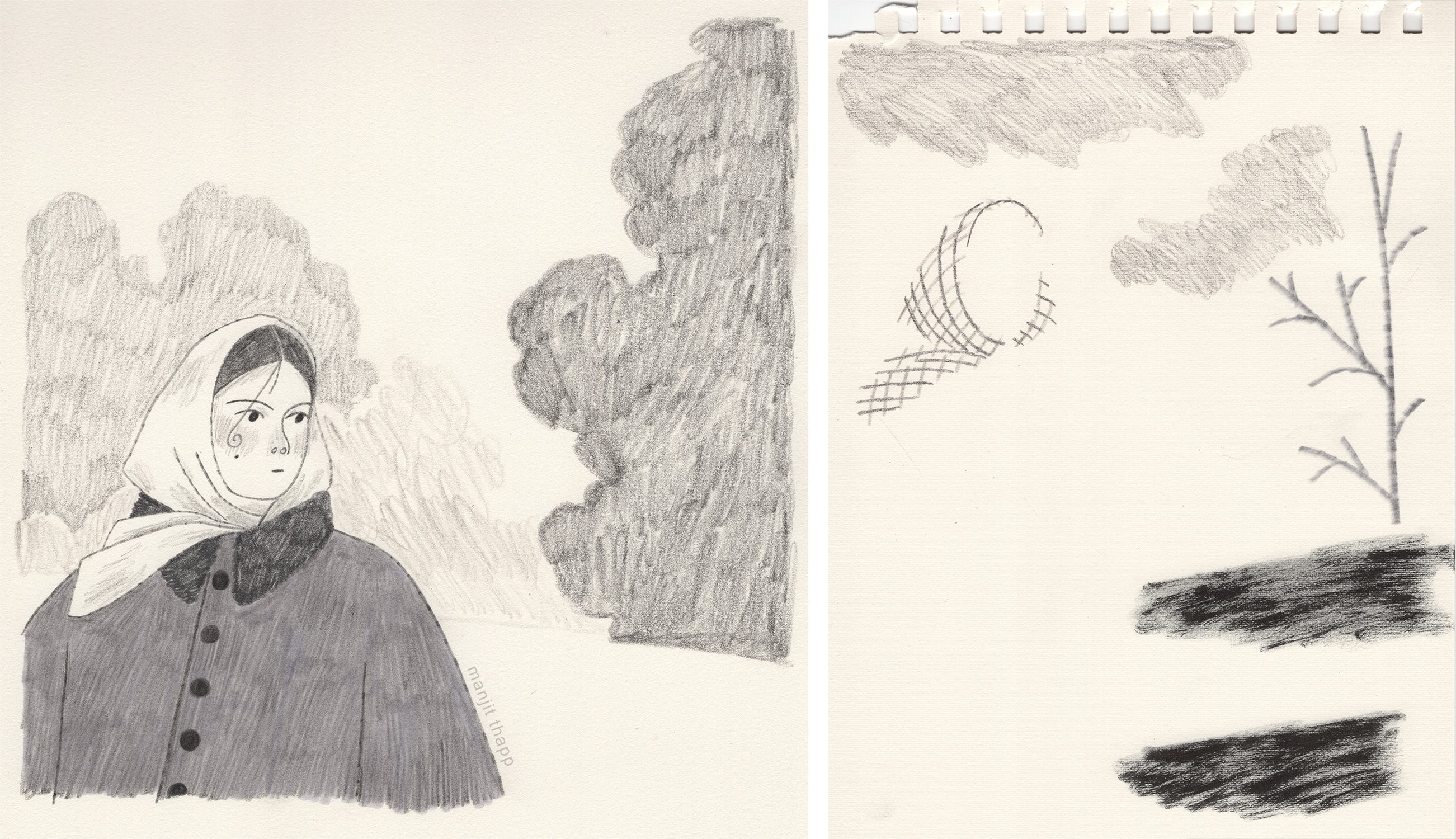
First up is a drawing I worked on back in August. I loved the sketch and knew I wanted to give this a go as a fully traditional piece. I can’t find the final colour test I did but below is an earlier one.
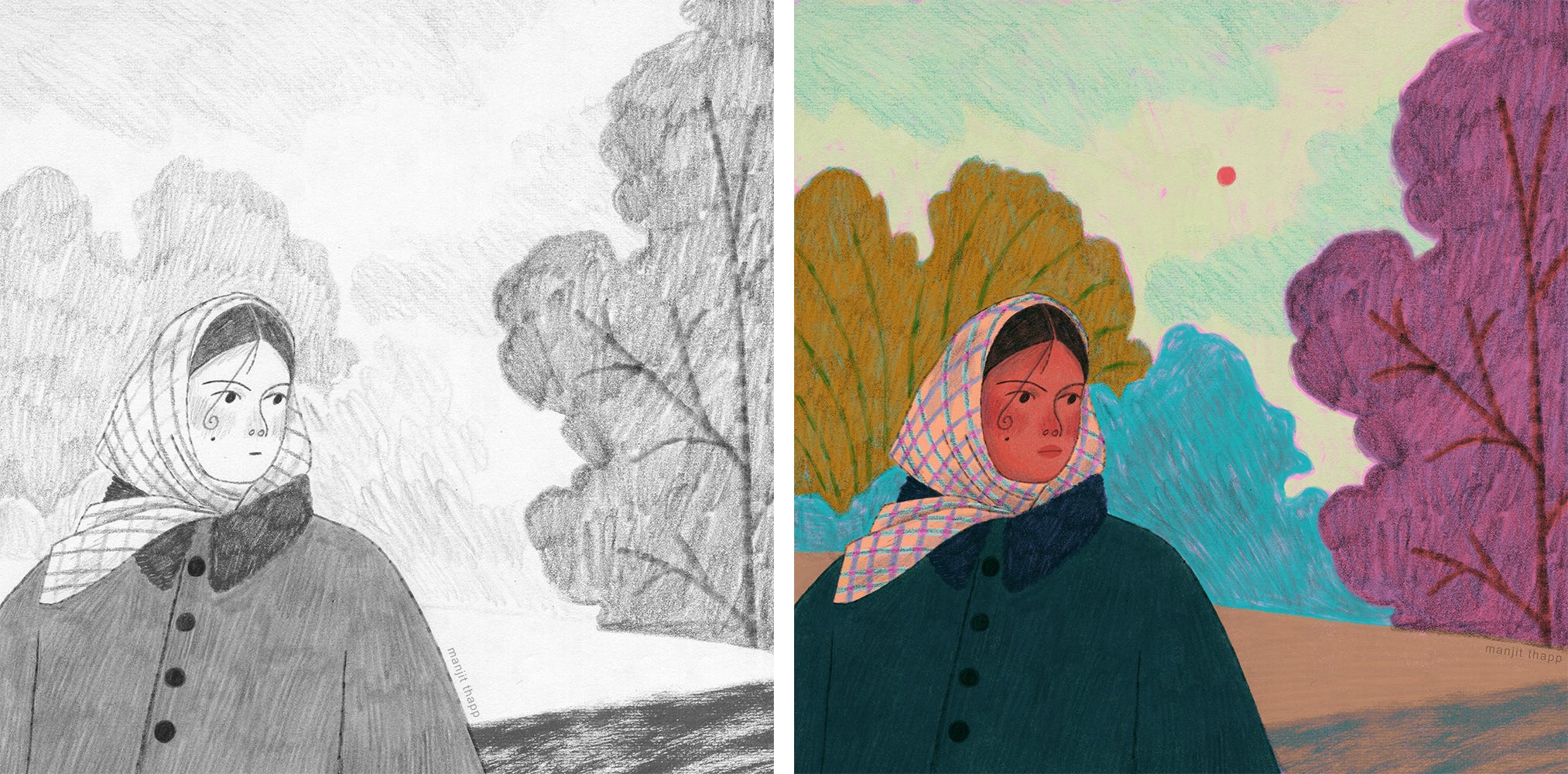
I picked out the colours and media I was going to use: wax pastels, colouring pencils, and markers. Because the girl is so small in the piece, I knew I would struggle drawing her within the piece, so I drew her separately larger and added her in later using Photoshop. I worked on A4 paper for this, which was a mistake. I personally find working traditionally at this scale really difficult and overwhelming. Another thing I’ve found is that by doing a colour test first, especially a digital one, I find myself getting so laser-focused on replicating those exact colours that I’m not even concentrating on the drawing as a whole; I’m just figuring out what colours I can overlay to get that exact shade. Doing a super refined sketch doesn’t help either; I kept trying to create those exact shapes! I think back to the traditional work I did in my mini sketchbook, which I worked on freely—no plans in place. I know this needs to be my approach moving forward with traditional work.
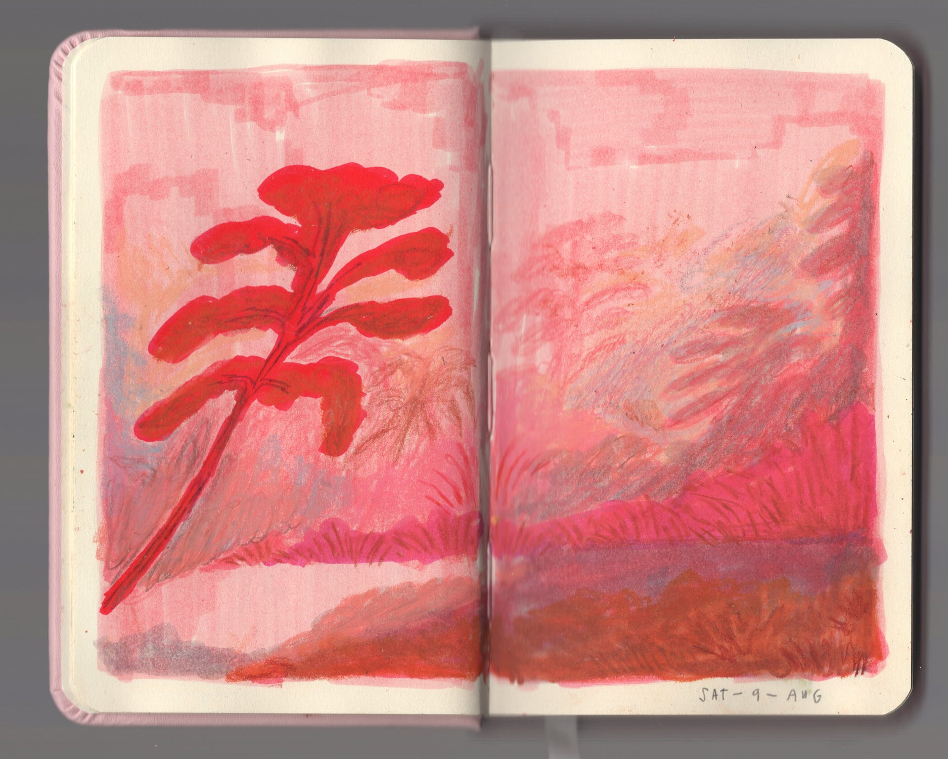
Here are the direct images from my scanner. The colours scanned in a little dull compared to what they are in real life but that is an easy fix.
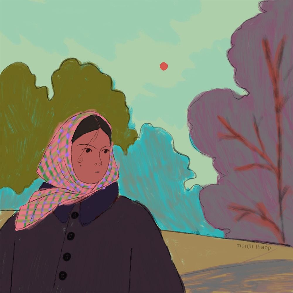
The piece felt so stiff and lifeless to me; I could see that I was just trying to match the sketch and the color test and not enjoying the actual making. Feeling frustrated, I threw it into Procreate and worked over it. I felt slightly better about it but not enough; the whole point was that I wanted to make something traditional and I’d done more digital work on this than I would have wanted to.
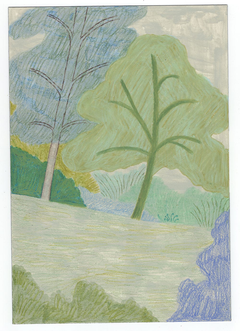
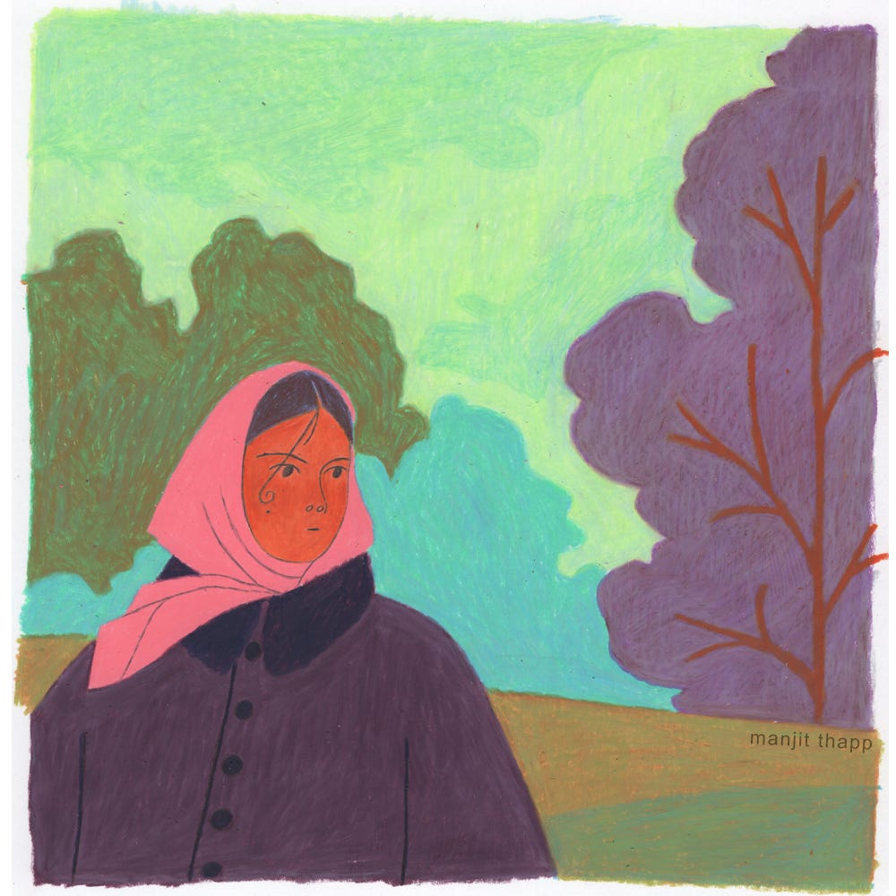
I didn’t want to abandon the piece and found myself still thinking about it days later. I was doodling in Procreate and came up with this.
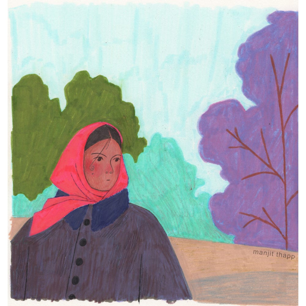
These colours felt bolder and so much warmer; I also liked the composition much more. I decided to try this out traditionally and worked on a much smaller scale this time. I was so much happier with the outcome!
The next piece is one of my ‘Peachtober’ entries. The prompt for this day was gingham.
I wanted to do this piece using just wax pastels, as it had been a while since I’d used them. I didn’t feel any particular way about it once I’d finished but after scanning it, I knew it was not the one!
Below is the direct scan; the colours scanned strangely and I didn’t feel like taking it into Photoshop to fix.
I didn’t want to give up on working on this one traditionally, so I quickly decided to do a mixed media piece using markers, colouring pencils, and some wax pastels. Another direct scan where the colours came up weird. I liked this version even less than the last.
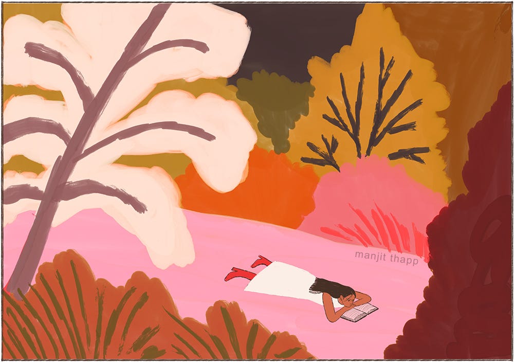
It didn’t help I was working on these in the evening and felt rushed. I decided to create the piece in pencils and add colour digitally, a process I feel so comfortable with.
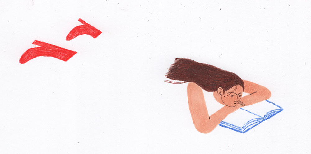
Below are my scans, I used pencils, colouring pencils, markers and a brush pen. If I’m unsure about something I like to work on it seperately so I can decide later if I want to include it in the final piece or not, you’ll see this in the second image.
I then added colour digitally in Procreate; I tried to work as quickly and as loosely as I could. I filled the background in a bright pink first and I like how it peeks through in places. I also really like the way the pencil textures look in the trees!
To end, I still really want to push myself to create more traditional work and feel confident with it. I think I’ll need to start working without much of a plan in place, similar to my sketchbook work. I hope it was interesting to see some of my process; more soon!
A fellow overthinker, lol
Thanks for sharing your process! It's inspiring to see, I really love your final versions of your illustrations!